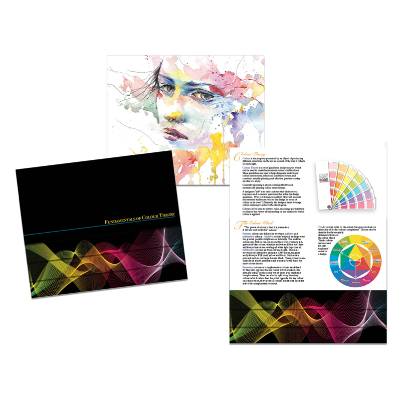
Fundamentals of Colour
Colour is the property possessed by an object of producing different sensations on the eye as a result of the way it reflects or emits light. Colour Theory is a set of guidelines and principles which can be used to create harmonious colour combinations. These guidelines are sure to help designers understand colour interactions, select and combine colours, and construct visually pleasing and effective palettes to relay an idea or a story. Generally speaking it is about creating effective and aesthetically pleasing colour relationships. A designers “job” is to select colours that elicit correct responses and to answer questions that solve the design questions. Who is it being created for? How will internal and external audiences react to the design in terms of colour on its own? Ultimately the designer must leverage colour, meaning to achieve the clients goals. Colour can be used to irritate, relax, encourage participation or alienate the viewer all depending upon the manner in which colour is applied.
Psychology of Colour
Colour can invoke any number of emotional responses. Associations to colour can be specific to a country or region and interpretation of colour can be affected by age, gender, personal experience, mood, ethnicity, history and tradition. Some are universally recognized while some can have different or opposite meanings based entirely upon their context and application. An example of this could be the colour red which culturally can mean different things, but can also represent anger and hate as opposed to love depending on its use. What is more consistent about red is that it represents passion whether positive or negative. When creating a design it is important to know who it is being created for and how it will read to internal and external audiences in terms of colour on its own.
“What about colour is so Important? Why Colour? Colour is like food if something looks good, then it is appetizing to the person seeing it. Likewise if colour is handled properly it makes a design stronger.
Colour Harmony
Direct Harmony, is the first and most basic of all the harmonies. All types of harmonies are based off this basic harmony with the exception of analogous harmony. Direct harmony can also be called complementary harmony because of its high contrast of secondary/complementary colours to create a very effective and vibrant look. When used at full saturation it can be jarring if not applied properly. It is the most common and easiest to find harmony. Direct harmony colour schemes work well when a designer wants something to stand out, however this does not apply to text as both colours have a similar intensity and will fight for attention.
Split Complementary, is the second harmony which allows for a nicer range of colour even though it does not deviate too far from the basic harmony between primary and complementary colours. Split complementary refers to the two colours directly to the left and right of the complementary colour. It has the same strong visual contrasts the complementary colour scheme does but has less tension. A designer can safely use this colour scheme as it is extremely difficult to make a mistake and generally always looks good.
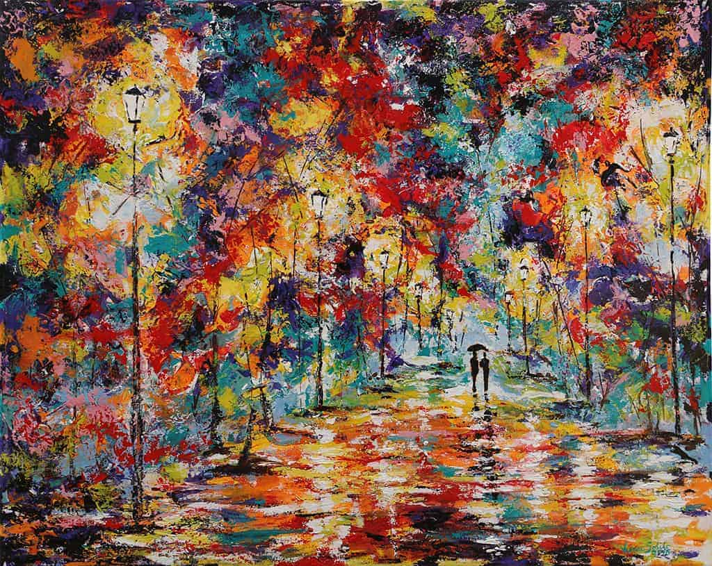
“Painting created by Verone Solilo, a brilliant painter and master of colour. She is an inspiration, as her colour sense and fearless painting style are exemplary as an example of how to successfully utilize colour.
Triadic Harmony, is the third harmony and this harmony uses three equally distanced colours and thus it stretches the basic idea of colour harmony. For this reason this harmony is best used with only hints of colour. Too much of each and the design will appear to be too vibrant or have to many colours. Using triadic harmony requires the colour to be carefully balanced, for instance one colour is dominant while the other two provide accents of colour.
Analogous Harmony, is the fourth harmony and it refers to related colours. Colours that you would find to the left or to the right of the main or key colour on the colour wheel. In this harmony the colours blend extremely well to create a serene and almost monochromatic and comfortable design.
Tetradic Harmony, is the fifth harmony and its is defined by the idea that there are four equally distanced colours on the colour wheel being utilized. Basically it is a design that uses two sets of complementary colours. This harmony is best used when you have numerous elements that all need to stand out on their own. By using four colours equally distant on the colour wheel each element gets equal attention. “The deliberate avoidance of harmony must be viewed as a means of causing an agitated or aggressive, chaotic reaction in the viewer". unknown