A Bit About Type
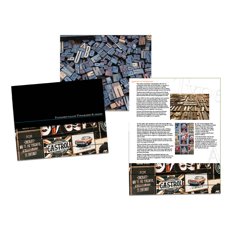
Type exists everywhere. Typography is the “art” of creating the letters that we use everyday. A Typeface is the design you see, the style and look of a specific character, where as a font is a collection or set of letters; the machine used to get the message across to the viewer.
Typefaces historically have been influenced by things such as technology, cultural shifts and for some simply sheer boredom with the state of typography as it was.
In the 1400’s the first movable typefaces were invented thanks to a man named Guttenberg. This provided a cheaper way to obtain the written word. Up to this point in history all written materials were created by hand and were both time consuming and costly. Guttenberg also created the very first typeface which was called Blackletter; it was dark, somewhat practical and intense, however legibility was an issue.
“Around 1470 Roman type was created by Nicholas Jenson where he was inspired by the text seen on ancient Roman buildings. It was more legible than Blackletter and caught on very quickly.
In 1501 italics were created as a way to fit more words on a page which for the printers was far more cost effective. Italics were created by a man named Aldus Mantutius.
Between the years of 1734 and 1780 men such as William Caslon, John Baskerville, Firmin Didot and Giambattista Bodoni continued to develop and create inovative, and sometimes refered to as “fresh” new typefaces that currently can still be seen today as staples in a typographers collection of go to fonts.
Vincent Figgins in 1815 conceptualized the creation of slab serifs also called Egyptian typeface, which was the first time serifs were squares and boxes.
1816 saw the first sans serif (without serifs) created by Willam Caslon. The concept of san serif was not well received at the time, but was to become the start of what we now consider san serif typefaces. Type at this time exploded and many variations were created to accommodate the needs of growing advertising.
Frederic Goudy became the worlds first full time type designer around 1920, at which time he developed numerous ground breaking typefaces; Copperplate, Gothic, Kennerly and Goudy Old Style.
In 1957 a Swiss designer, Max Miedinger created Helvetica which was to become the most loved typeface of all time. This began a return to minimalism and the creation of many other simplistic typefaces like Futura began to surface.
Currently thanks to technology in our modern day we have a cornucopia of old and new typefaces available for us to peruse and use. This gives designer an abundance of options and looks by which to create, unlike the tow that were available a few hundred years ago.
Principles of Typography
Legibility is key! The best way to achieve typography success in adhering to some specific guidelines along the way. Starting with the idea that white space is not empty space. How to effectively use type and imagery, hierarchy, scales and contrast and framing make all the difference.
Type is only type when it is friendly, so if it can't be read it serves no purpose. It should be expressive, visually inventive and conceptually resonant, yet it should still relay information effectively. Legible typefaces should be chosen, while avoiding weird colour contrasts. Text should be set in a size that is legible to even those who may not see as clearly.
Choose typefaces for specific purpose, and avoid to many type faces in one design. Show restraint, a good rule is to maintain two or three kinds of type faces in a project, because a change in typeface usually signals a change in function. A single type family with a variety of weights and italics can be enough, and a second can add contrast. To many can be distracting and can cause confusion in the design.
Consider type as an image, and treat it as such. Type is visual and should be used with intent. A type face consists of lines, dots, shapes and textures that should ideally relate compositionally to the concept in the design, regardless of their differences. It is important to avoid redundancies, and be considerate of the information being conveyed by a project's text.
Any design's message should be balanced between imagery and text. Images and text don't need to say the same thing. Instead consider what text isn't saying to the viewer and let the image fill the gaps. Conversely, text should tell what the images don't show. Image and text working together should complete each other and contribute to a new and deeper understanding. This can help the viewer become more intensely engaged.
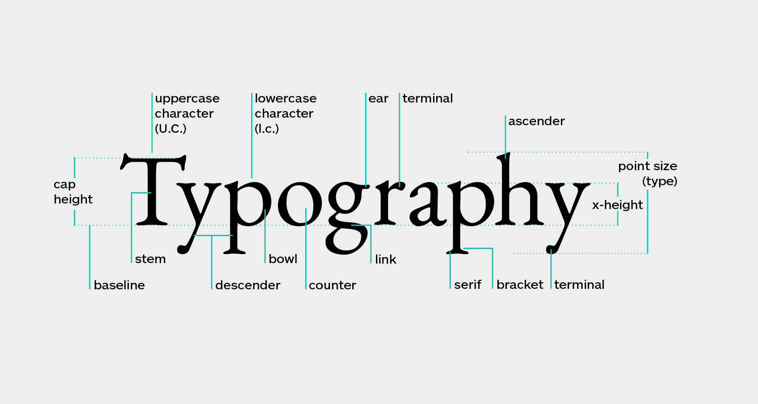
“Each typeface follows a formula which is consider its anatomy, each component varies and this is what defines each typeface. As seen above the components that make up a typeface.
Alignment Logic, and Spacing
The alignment is the configuration to which type is set. Flush left, flush right, centered, left justified, right justified, and center justified are types of alignment. Flush left, right and centered all have lines that are "rag" meaning lines are different lengths, where as justified is suggestive of all lines being the same length.
Alignment affects the text within the paragraph and there for must be considered when searching fro a desirable text setting. For large volumes of text there are really only two types of alignment that should be considered and are acceptable, and they would be flush left, and justified. The optical properties of the other alignments dramatically impair the ability to read the text comfortably. This can happen because the other alignments affect the spacing in the text; the kerning (the horizontal space between two consecutive characters) and tracking (space between characters in a complete section of text) can be directly affected.
Spacing can be adjusted by changing the leading, tracking or kerning to create a visually pleasing and consistent experience. Leading refers to the vertical spacing between lines of text; baseline to baseline.
Texture and Space
Dividing space creates structure, which can unify, elements in a composition. Placement of text and images creates the tension between positive and negative space, and the invisible linear connections between elements. This is the driving force of good typography. Visual structure is relative to how lines are formatted, this is created when the elements are positioned purposefully to subdivide the space, but doing this differentiates shapes of negative space can be created. The idea of massing some items to set the tone for similarity and separating others to give them distinction causes focus, emphasis and movement.
Hierarchy
Information is systematic, appearing as a collection of parts all with different function. Call outs, captions, sidebars, articles are all parts of the primary content supporting a concept or design. These parts can often repeat and appear within the same space, supporting each other. It is for this reason that information needs to be provided in an order that allows the viewer to navigate it. This is called “navigational hierarchy”. Text and images are organized based on a level of importance of what should be read first and the distinction of function among all the parts.
Creating hierarchy means defining and clarifying the function of information components based on their formal relationships. Clear contrasts are important for hierarchic clarity, but not too much to create a visual disconnect.
Scales and Contrast
Consider hierarchic levels in terms of how separate in emphasis they need to be along with what information structure they share essentially. The “scale” of the text helps to define its importance. The contrast between can define the most important down to the copy or explanation. This can directly impact the amount of scale, typographic colour and stylistic changes and can also influence the contrast in a hierarchy.
Typography is such a huge topic that this barely touches the tip of it, but perhaps there is just enough information here to spur a little interest in something that is a hugely important aspect in design. Who knows perhaps there is a little tidbit or two here that maybe someone did not yet know.