Fundamentals of Layout and Composition
“Design is both a verb and a noun. It is the beginning as well as the end, the process and product of imagination”.
Paul Rand/Graphic Designer
his book: Design, Form and Chaos
Yale University Press: Newhaven 1933
“Design is understanding what part form and content play, and to realize that design is a commentary, opinion, point of view and social responsibility. It is not enough to just “assemble” order or even edit, but to add value, and meaning, to illuminate, simplify, add clarity, modify, dignify, dramatize, persuade and possibly even to amuse.
Hierarchy and Scale
To focus a viewers attention and give the viewer one important thing like a big shape, startling image, type treatment or even a daring colour will lead their eye to the most important followed by the lesser important items in a logical way. This is called hierarchy, the order in which you want the viewer to look at the material. This is essential for access and understanding. Information systematically appears as a collection of parts, all with different function, call-outs, captions, and sidebars or the primary content are all provided in an order that allows the viewer to navigate it, which is called informational hierarchy. These parts can often repeat and appear within the same space supporting each other.
Content is organized based on importance, what should be read first and the distinction of function among all the parts forces the designer to ask the questions; What are the distinguishable parts to be designed? Which parts should be the main focus of the readers attention? How do the parts that are not the main focus relate to each other? How do these relate to images that accompany the text elements in the layout? Does the viewer need to identify and comprehend a particular grouping of words before the focus on the main part?
Creating hierarchy means defining and clarifying the function of informational components based on their formal relationships. Clear contrasts are important for hierarchic clarity, but not so much so to create a visual disconnect.
Consider hierarchic levels in terms of how separate in emphasis they need to be along with what informational structure they share. Essentially the “scale” of the content helps to define it’s importance to the rest. The contrast between content can define the most important down to the copy or explanation of the body copy.
Fight the flatness by avoiding creating everything the same size, weight, colour and perceived distance from everything else because this would be dull and lifeless.
By exploiting changes in size and transparency, creating differences in density and openness, by clustering and separating objects creates depth and movement.
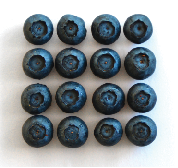
Rule of Odds
The rule of odds states that framing your subject with two other surrounding objects creates an odd number of three, which suggests balance and harmony visually. Thus making three a comfortable grouping as people tend to prefer balance.
When using groups of two or four it can sometimes create a sense of competition where as groupings of odd numbers make a design feel balanced. Although this rule is subjective it does in fact create balance.
It is important to note however that odd numbers generally just refers to three. When using five or more objects it creates more density than the viewer will perceive and the effect becomes null. When using larger numbers of objects however a designer could consider grouping them in to three groups, which again would satisfy the rule.
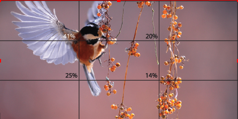
Rule of Thirds
This is a method of laying out a design which consists of a grid overlay with three horizontal lines and three vertical lines. Basically it divides the space into sections which are thirds. This makes a grid of nine equal shaped boxes. The important part of the grid is where the lines intersect as these are called focal points or sweet spots. It is important to note that these four sweet spots differ in their visual appeal to the eye.
Using the rule of thirds to design a layout is a conclusive way to achieve hierarchy in a design when considering the delivery of the content. How the eye scans according to the rule of thirds.
Balance, Rhythm and Contrast
Creating space; negative white space is important to good design, it brings focus to contant and provides a resting space for the eyes. Negative space is as much a shape in a layout as any other part. It needs to be carved out and related to other elements so it makes sense. A lack of negative space can be overwhelming and create an oppressive presentation that no one will want to deal with.
It is important to create balance between the active and inactive space.
When thinking of balance there are two types of compositional logic; one is symmetry in which forms respond positionally to a central axis of the format. They can be structured simply on a single axis or two or three axis’ for greater complexity. The relation of forms to this axis is subject to variation; mirrored, reflected, or inverted in orientation across the axis.
The second compositional logic is asymmetry where relationships among the axis and contours of subject forms do not respond to a single axis. This contrasts the conditions set by symmetrical logic in that no sets of spaces or contours of forms will correspond with each other in a direct repetition.
Symmetry imposes a strict order on arrangement that can create a formal disconnect in elements that violates them, and can be static unless challenged and resolved successfully by the designer. Asymmetrical requires a continuous differential in structure in order to accomplish resolution.
“In design proximity is as simple as objects near to each other are seen as a unit. Related information is placed together which forms a visual unit. Proximity helps to achieve clear visual hierarchy, as like elements are grouped while those that aren’t are separated.
Rhythm is perceived movement, changing the space between elements by means of changing the lengths of intervals between elements by moving some closer and others farther, invites comparison. This creates the conclusion that the forms are moving in relation to each other. The nature of a particular rhythm in a layout contributes to the totality of its logic and will create varying levels of energy or restfulness. This is important to the delivery of visual interest, and also the emotional or conceptual message.
Contrast is defined by creating areas of different presence or quality which is fundamental to a successful composition. There are many individual kinds of contrasting relationships that can be exploited and utilized by a designer to create visual opposition. These are used to create depth, movement, and impart vitality.
Contrasts such as line vs plane, geometrically ordered vs randomly scattered, large vs small, compressed vs open or light vs dark. Expressing contrast and how the compositional space appears in different areas as a totality, is essential. Contrast whether extreme or more subtle, sets up all other content.
While contrast applies to the relationships between elements it can also refer to the resonance of different states of contrasting relationships among forms and spaces interacting with in the format together. This can be referred to as tension and can be substituted for the word contrast when describing individual forms or areas that focus on a particular kind of contrast.
Alignment Principle of Design
Alignment is the placement of visual elements so they line up in a composition. Alignment is used to organize elements to group, create balance, structure, create connections between elements and to create a sharp and clear outcome.
There are two alignment principles; edge alignment (left, right, top or bottom and center alignment (aligned to center line). These are often invisible lines which visible elements are aligned to or can be hinted at. Used to achieve a particular look or feel.
Where elements are aligned a composition can appear clear, confident, elegant, formal and trustworthy. When visual elements are out of alignment it can be very noticeable and devalue a design if it was not intentional.
Using grids can create an invisible structure on which elements can be placed. Grids assist in accuracy an consistency when placing elements.
Repetition repeats same or similar elements through out the design, not to be mistaken for repetition of visual elements as a pattern, which is more to do with visual style or artwork in an overall piece of design work.
Some aspects of a design repeat through out to simplify or create complexity in a work. It is used to create a sense of unity and consistency throughout a design. Repetition creates a particular style, create cohesiveness, emphasis, hierarchy, structure and can strengthen a design.
The repetition could be a colour that repeats, a graphic purposefully placed through out, or a particular element in the design that repeats like a series of events.